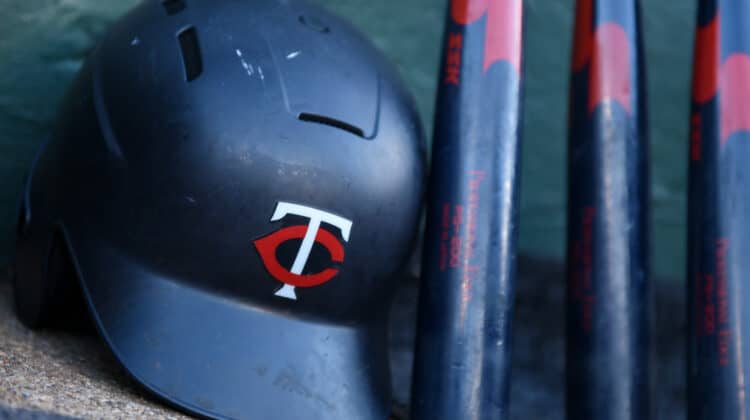
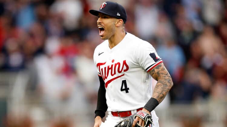
The Minnesota Twins revealed some new logos, which were on full display on the team’s new jerseys.
While the jerseys were mostly well-received by local Minnesotans and general fans of the team, there was some hesitancy from the general public.
After the launch, the team shared additional insight into the meaning behind the jerseys and new logos in general.
The red star on the M logo and sleeve patch represents the North Star, another recurring motif in the design. That’s how they wanted to anchor the new M to representing Minnesota. pic.twitter.com/GxgaxB2b7m
— Do-Hyoung Park (@dohyoungpark) November 18, 2022
The Twins have maintained the same general theme in their jerseys for several years now.
Adding this refresh to their jerseys, logos, and brand as a whole may be just the catalyst that the team needs to jump-start the 2023 season.
What’s In A Name?
With this launch, the Twins didn’t change their name but added a unique element to their jerseys that hasn’t previously been displayed.
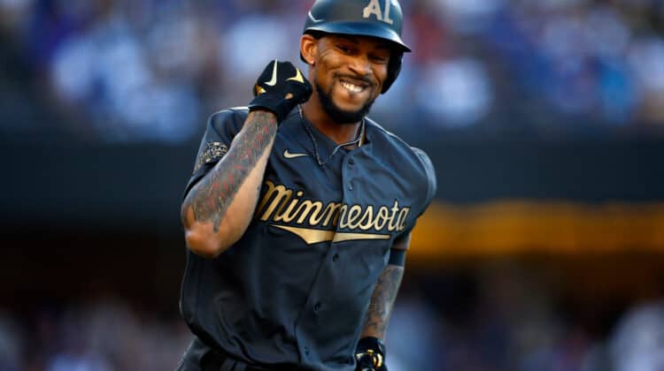
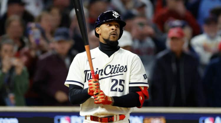
The “Twin Cities” mark that is on one of their alternate jerseys, is a familiar term to locals, but may be unfamiliar to those not from the area.
The two Twin Cities that are often represented in Minnesota lore are Minneapolis and Saint Paul.
The North Star, represented in the image above, is also a major aspect of Minnesota’s history.
Before the Minnesota Wild was a franchise, the Minnesota North Stars was the state’s hockey team from 1967-1993 before relocating to Dallas.
Besides the sporting implications, the Minnesota state motto is “L’Etoile du Nord,” French for “Star of the North.”
Again, for locals, the new jerseys are a fantastic representation of Minnesota’s history and culture.
As more and more feedback flows in, it remains to be seen what the league-wide feedback will be of these new uniforms and team branding.
NEXT: MLB Fans React To The New Twins Uniforms