The Minnesota Twins have revealed some new uniforms.
And they look quite nice.
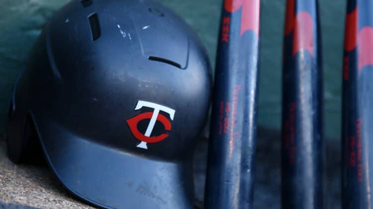
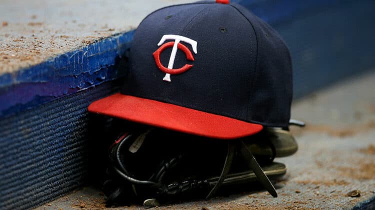
If fans were ever confused about why the Twins hats had a T and a C as the logo, they now have an explanation.
The T and the C stand for “Twin Cities” representing the closeness in proximity of St. Paul and Minneapolis.
Their new cream-colored jerseys will feature the words “Twin Cities” on the front in navy blue.
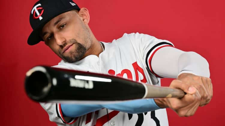
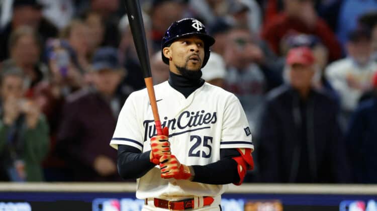
The Twins posted a picture of AL Batting Champ Luis Arraez donning the brand-new threads.
For the first time ever: Twin Cities. #AllTwins https://t.co/KklRxsdVK8 pic.twitter.com/Gw8e2iyXSf
— Minnesota Twins (@Twins) November 18, 2022
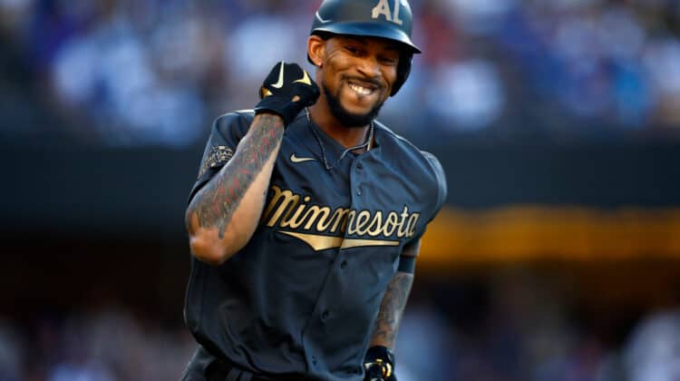
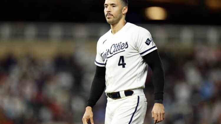
Another picture was shown to reveal the full breadth of the new designs.
— Minnesota Twins (@Twins) November 18, 2022
Twins Reveal Beautiful New Uniforms
When teams reveal their City Connect uniforms, fans are typically enamored with the new look, and often times, it’s quite a good look.
But the Twins appear to be branching out a little bit and changing things up with a more complete redesign.
The typical uniforms of the Twins featured the navy blue and bright red mixed together.
But one of these new uniforms features just a nice cream-colored jersey with some navy blue on the front, sides, and back.
The T and C logo will still be featured on their caps, at least in two versions of the new uniforms.
Now, fans in the Minneapolis-St. Paul area are clamoring to get their hands on one of these beautiful new jerseys.
The day the Twins debut these uniforms will be a special day in the Twin Cities.
NEXT: 2 Moves The Twins Need To Make This Offseason