On April 13, 2020, the Indianapolis Colts unveiled minor tweaks to its uniforms and logos for the upcoming season.
The Colts are one of 7 teams making uniform changes for 2020.
7 NFL teams are doing some sort of rebrand, per @joereedy. #Rams unveiled their awful logo yesterday. Uniforms to come#Browns, #Bucs & #Falcons – new unis in April
Surprise: New logo for #Chargers, new unis for #Patriots, tweaked #Colts uni/logo!👀@PhilHecken @GameplanChicago
— John Sabol (@John_Sabol) March 24, 2020
No one really knows who is the mastermind behind these uniform changes or if any rhyme or reason is logically imposed.
But uniform changes give us something to talk about leading into the draft so we are all for it.
Here are the 5 key changes to 2020 Colts uniform.
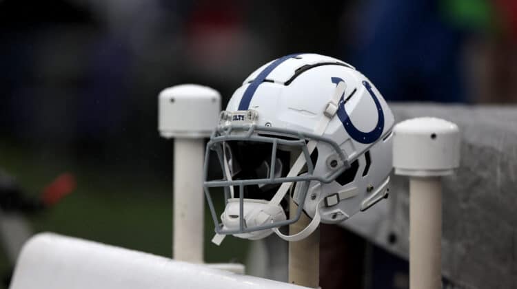
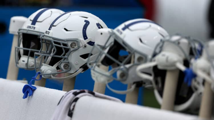
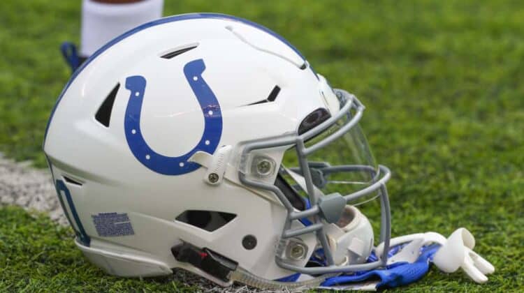
1. Helmet Logo
Subtle is the word when it comes to the change of the helmet logo.
The new horseshoe has a wider opening at the top and is more rounded in shape.
What’s old is indeed new because this horseshoe has the same specifications as the classic horseshoe of years ago.
It apparently morphed in size and shape over the years so this rebranding was a good opportunity to reset it.
Honoring our past. Always evolving. pic.twitter.com/BBWqIG7p6p
— Indianapolis Colts (@Colts) April 13, 2020
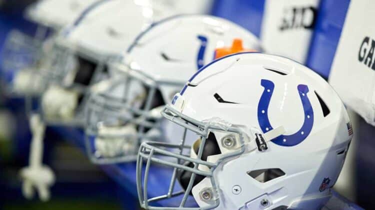
2. Number Font
In a nod to the successful Baltimore Colts teams of the 1950s and 60s, the number font on the jersey has been adjusted back to what it was during the Johnny Unitas era.
The numbers appear more squared and boxy around the edges.
Of course, the same number font will appear on the helmet as the jersey.
3. Maker’s Mark
File this one under a change that makes no sense.
The maker’s mark (aka Nike logo) will now be black on the white jersey.
Previously, it was blue.
No one really knows the origin of this change since the color black has never been present on the Colts uniform.
Could this mean the color rush uniforms might be black?
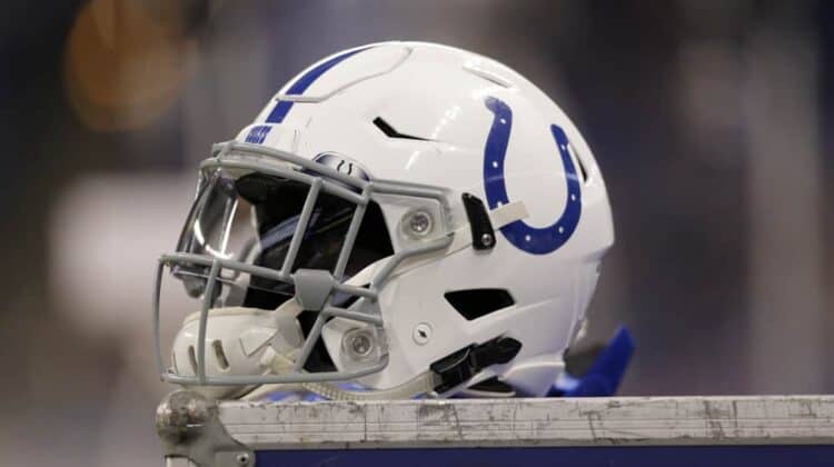
4. Wordmark Decal
Consistent with the font of the jersey number, the Colts name as it appears on the front and back of the helmet will change to the wider and more boxy look.
This change is a no-brainer since the font of the numbers is changing.
It would look odd if it did not change.
5. Inner Collar Logo
Last, but certainly not least, is a new inner collar logo that thankfully won’t be visible on the field.
It is the letter “C” depicted in a shape similar to the state of Indiana with nail holes like those in a horseshoe.
Honestly, it looks as though someone took a bite out of the C.
Not present on the uniform is the new secondary logo of a bucking colt.
It is unclear where or how that will be used.
Conclusion
Overall the changes are okay.
Subtle enough for the hardcore decades-long Colts fan to embrace, but they are also new enough for young or newer fans to want to buy new jerseys and merchandise showing them.
Really, it could be so much worse.
Have you seen the Atlanta Falcons new uniform?
Enough said.
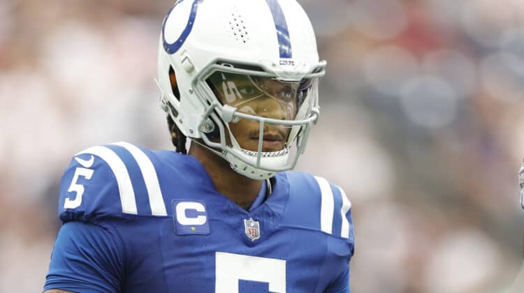
We also think Philip Rivers is thanking his lucky stars he is wearing a Colts uniform this season for many reasons.
One of which is the look of the new Los Angeles Chargers logo.
Passionate football fans really don’t care about what the uniforms look like.
They just hope to see their teams on the field this summer and fall wearing them.
NEXT: What Are the Odds The Indianapolis Colts Will Win Super Bowl LV?